
Is Color Making a Comeback? How we use Color in Home Staging.
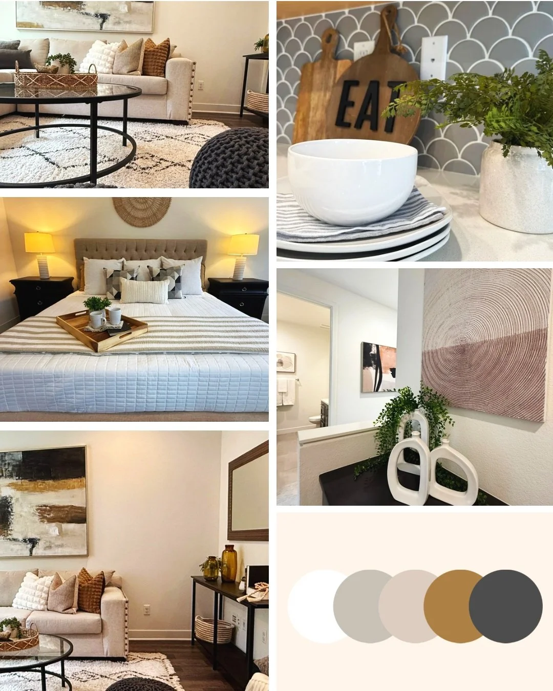
Never Boring Neutrals:
This palette is all about coziness and quiet sophistication—soft whites, greige tones, caramel accents, and hints of charcoal & black.
This color scheme works beautifully in spaces where we want the room to feel both calming and elevated. It’s neutral, but never flat. The variation in tone keeps the eye moving in a pleasing, natural way. We love using this palette for living rooms and bedrooms, especially in homes with warm-toned flooring or lots of natural light. Or, if the client requests a more neutral look. It feels relaxing but also luxurious.
Coastal Cool with Pops of Complementary Colors:
Soft sand tones, whitewashed finishes, and a pop of ocean-inspired teal give this palette a relaxed, easygoing feel. It’s ideal for coastal or light-filled homes, or when we want to bring in a touch of breezy energy to a smaller space like this one.
That hint of blue not only draws attention in listing photos (looks gorgeous!)—it also adds a sense of movement that makes rooms feel alive and spacious. The natural textures keep everything grounded, while touches of gold, ochre or mustard complement the cool tones.
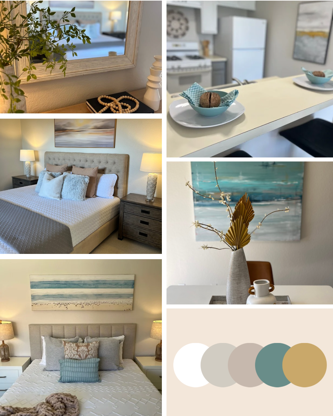
Coastal feel creates a chill vibe. Mixing teal with complimentary colors like mustard yellow really makes the palate pop!
Coastal Meets Sophistication:
This palette is all about balance: crisp white and taupe form a soft base, while deep navy and sage green add richness and depth. It’s a favorite for homes that lean more modern or architectural. This particular home was a beautiful colonial style home but it also lied very close to the shores of Encinitas. It needed a sophisticated coastal vibe that could bring the two styles together.
The dark blue gives just enough contrast to draw the eye and anchor key spaces (like a bed wall or built-in cabinetry), while green brings in a fresh, natural feel. Together, they create something calm, modern, and just a little bold just like the feel of “colonial meets the shore” style.
We love how this palette lets us create drama in a space without overwhelming it—it’s a refined kind of “wow” like something you’d see in a swanky East Coast beach town.
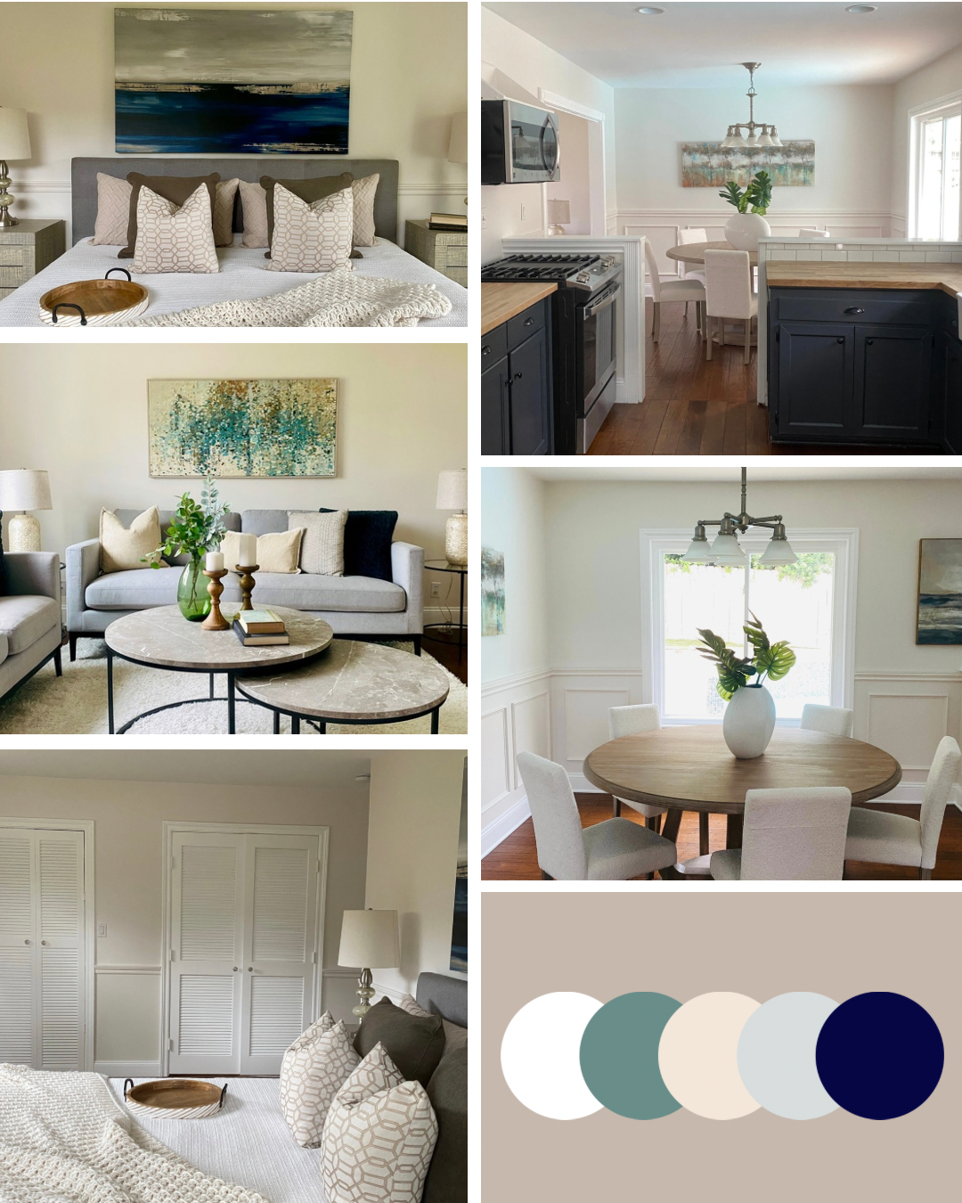
Crisp colors give the feeling of being on the coast but in a very subtle way!
Why This Matters?
We stage homes to help them sell faster and for more money—but just as important, we stage to create a feeling. Our use of color is never random. It’s always intentional, always tailored to the home, and always designed to please the eye—both in person and online.
When a buyer walks in and feels instantly comfortable, excited, or just at ease, that’s not an accident. That’s the magic of great design—and successful staging!